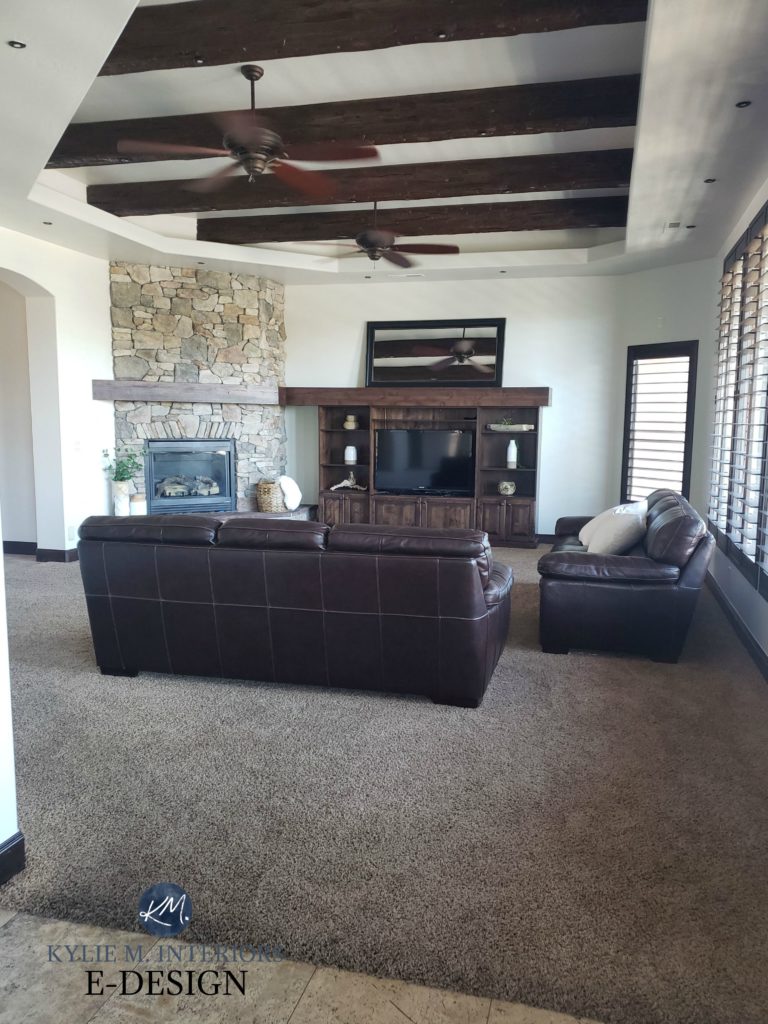
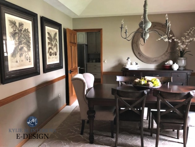
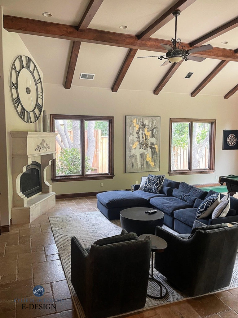
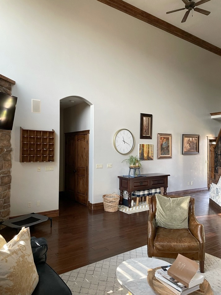
NON-WHITES That Go With Dark Wood Finishes
With a focus on updating the oaks and maples of the ’90s, it’s easy to bypass the slightly (or more) darker wood trims and doors of the ’70s and ’80s (or older). Oh, those were the days…shag carpets, avocado-colored fridges, and macramé plant hangers. Wait, isn’t some of this back in style again?
However, when it comes to the gorgeous medium and dark wood trims found in older homes, it’s usually less updating and more about purposefully chosen paint color partners to accompany them.
This post may contain affiliate links. If you make a purchase through links on our site, we may earn a commission.
What makes the dark wood trims in older homes more timeless than those found in 70s and 80s homes? Size. It matters in Starbucks drinks and trim proportions (usually, the bigger the better for both).

While dark wood trims in older homes can be impressive in thickness and quality, wood trims from the 70s and 80s are known for being narrow. So…
If you have thinner wood trim and think the STAIN COLOR is the main problem, think again.


- If you have the standard approx. 2 1/2 – 3″ dark wood trim, the SIZE is 70s/80s, not the stain color. In other words, don’t curse the color; curse the size. Once you get 3 1/2+ inches, things start looking better (that’s what she said).
- While painting your dark wood trim from the ’70s would help modernize your home, remember that it’ll still be narrower than the modern style of white trim work. The only way to REALLY update is to install more modern, wider moldings (oooof). At the end of the day, whether you paint it or not should come down to the contrast you want to see and how updated you want your room to look. If you like the contrast of dark wood with the wall color, that’s cool beans with me (it can be gorgeous; it’s just not the ‘modern’ approach. Modern shmodern).
- Generally speaking, the more ‘color’ you add, the less modern your room may look. Now, this isn’t a bad thing, as it can also look vintage and have more personality than a neutral color; however, if updating is your goal, NEUTRAL is usually best.
- The more color you add, the more you may complement your dark wood, meaning your wood could stand out and ‘pop’ more.
Now, you might be in a rush to see the paint colors – I get it. However…
This is a ‘learn how to‘ blog, not a ‘Kylie tells you what to do, and you mindlessly do it‘ blog, even though that can be fun, too.
This means I want to teach you the WHAT and the WHY, which will help you make smarter, more informed choices when choosing your home’s best color.
So, let’s talk wood.
WOOD STAINS, COLORS, & UNDERTONES
When choosing a stain for wood finishes, we often choose a ‘stain color’ without considering the ACTUAL color we’re creating. Or, if we have a stain color, we often refer to it when labeling our wood.
Colors like English Chestnut, Weathered Oak, and Early American don’t really mean anything in the color world.
Besides, how they look will change depending on the species of wood they’re applied to.

The Best Medium to Dark Green Paint Colors
So, whether you’re staining new wood or learning to coordinate with an existing wood surface…
Stop thinking of your trim as a ‘wood/stain’ and start thinking of it as a COLOR!
To help see the color of your wood, blur your eyes to block out the grain. It’s easier to see the COLOR of your wood when you remove the details, and you can then decorate accordingly around that.
Ideas to Update Your 1990s Kitchen
Let’s look at a few examples…
ORANGE-RED WOOD
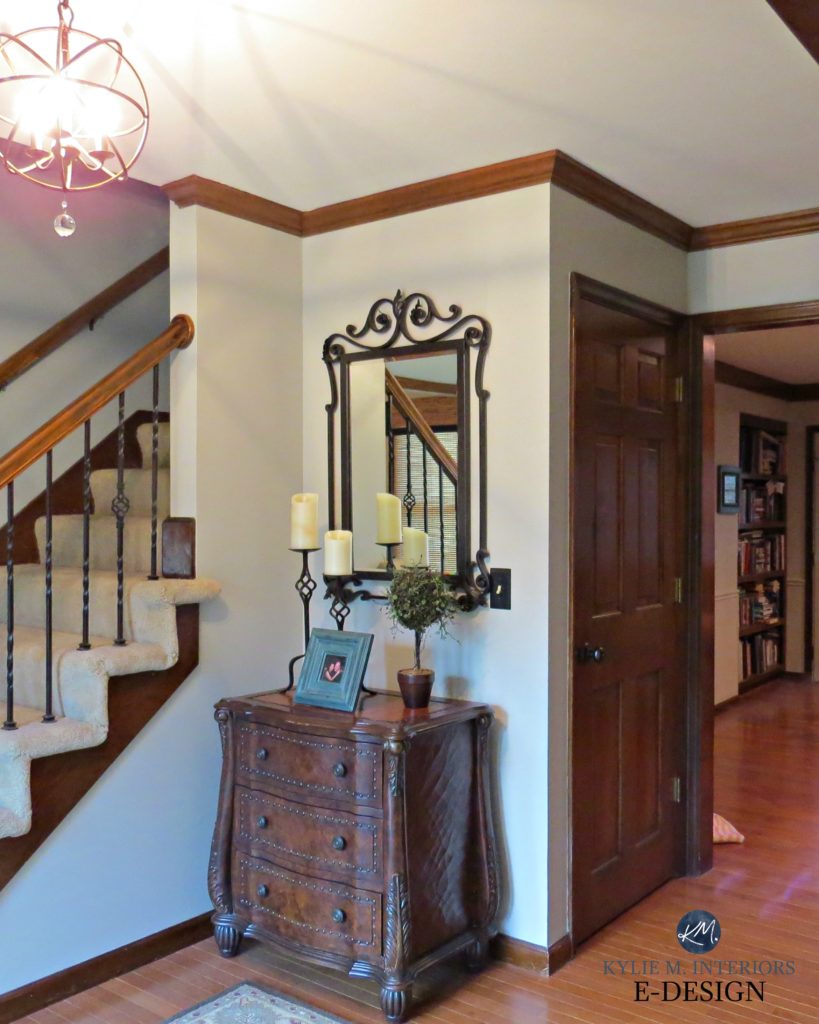
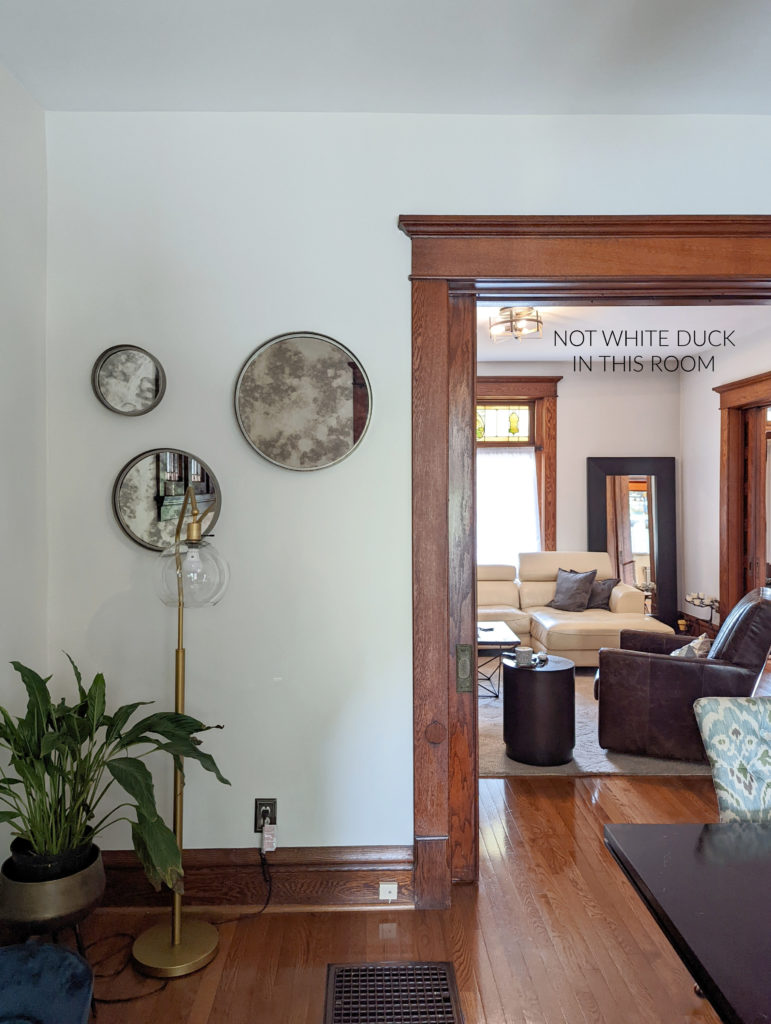
This next trim is a medium-depth orange-red colored wood with a lot of brown, so its undertones are orange-red. So, when I’m picking paint colors, I might not look at colors with a lot of yellow-cream in them, as the wood is more inclined to orange (beige) undertones or maybe even some taupe (violet-pink, pink being the light version of red). On the other hand, green is a beautiful contrast to this wood color if I want to highlight and enhance it.
If your wood trim is in this range, it’s a BIT lighter than most in this blog post. When you’re done reading, check out THIS BLOG POST (don’t worry, I’ll include another link at the end).
If you can’t figure out which undertones your wood finish has, decide which ones it DOESN’T have; e.g., the above wood definitely isn’t yellow-hued. That leaves orange, red, and purple as your options.
This next wood is a bit deeper and richer and has more red than orange, meaning it has red-orange undertones…

Mahogany is a wood species with a red undertone. It’s commonly found on trims, doors, and furniture. It’s not always as strong as the red-stained wood above, but it’s usually noticeable.
You’ll see my TOP COLOR PICKS listed shortly!
DARK RED-VIOLET WOOD (CHERRY)
Red hues are red-orange or red-violet. This next wood trim and door are definitely red-violet with not a drop of orange to be found!
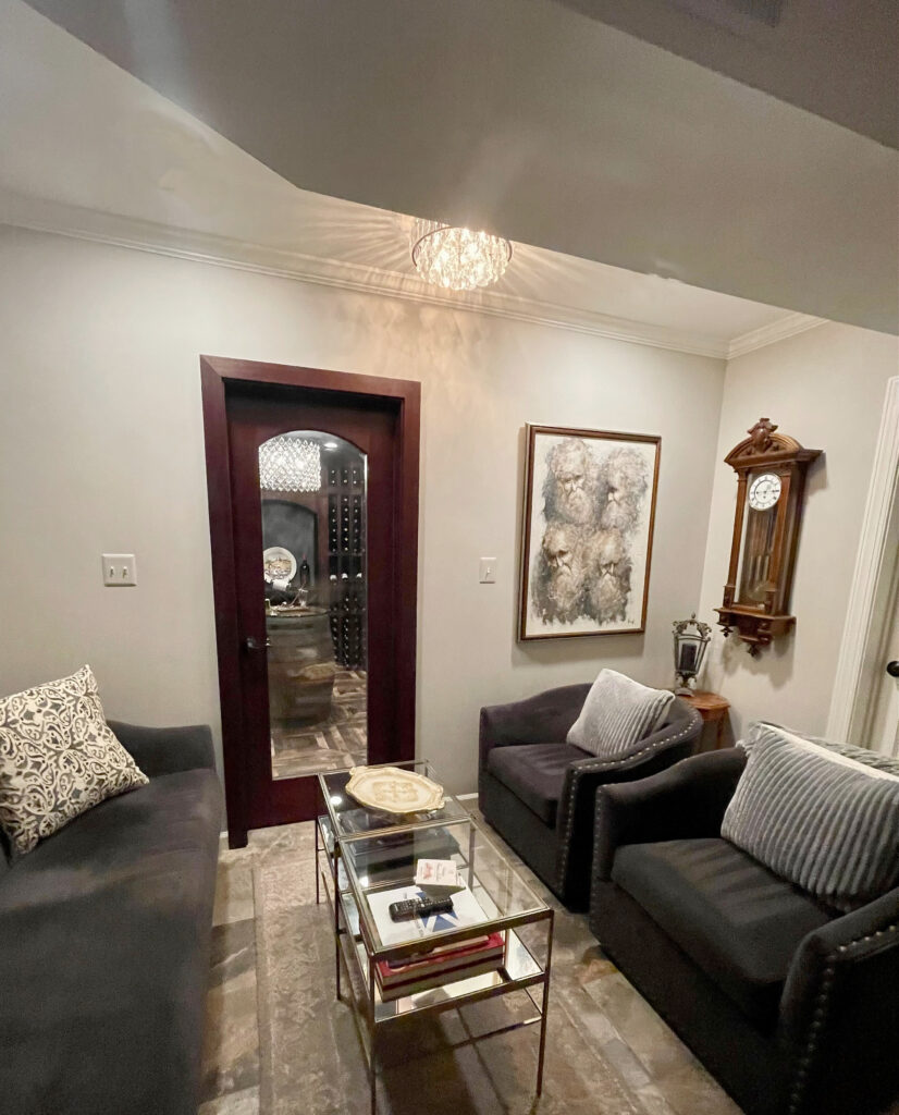

While cherry wood finishes are the most common red-hued woods, red oaks also have red-pink undertones, as can any wood if a reddish stain is applied!
Here’s another wicked, pretty red-purple…
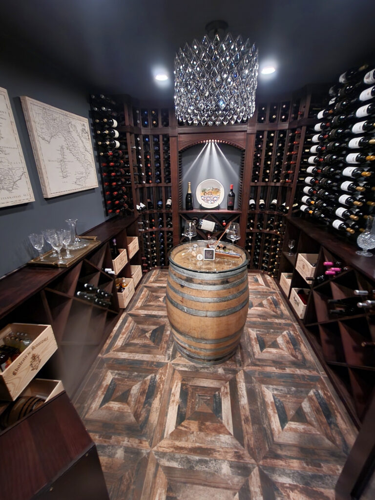

This wicked shade of navy is PERFECT with the red-violet hues in this room (and with the floor)
DARK BROWN WOOD
Some wood stains just look more or less DARK BROWN. Sure, there’s a smidge of orange-red in the one shown below, but the overall impression is BROWN, especially compared to the previous wood color.
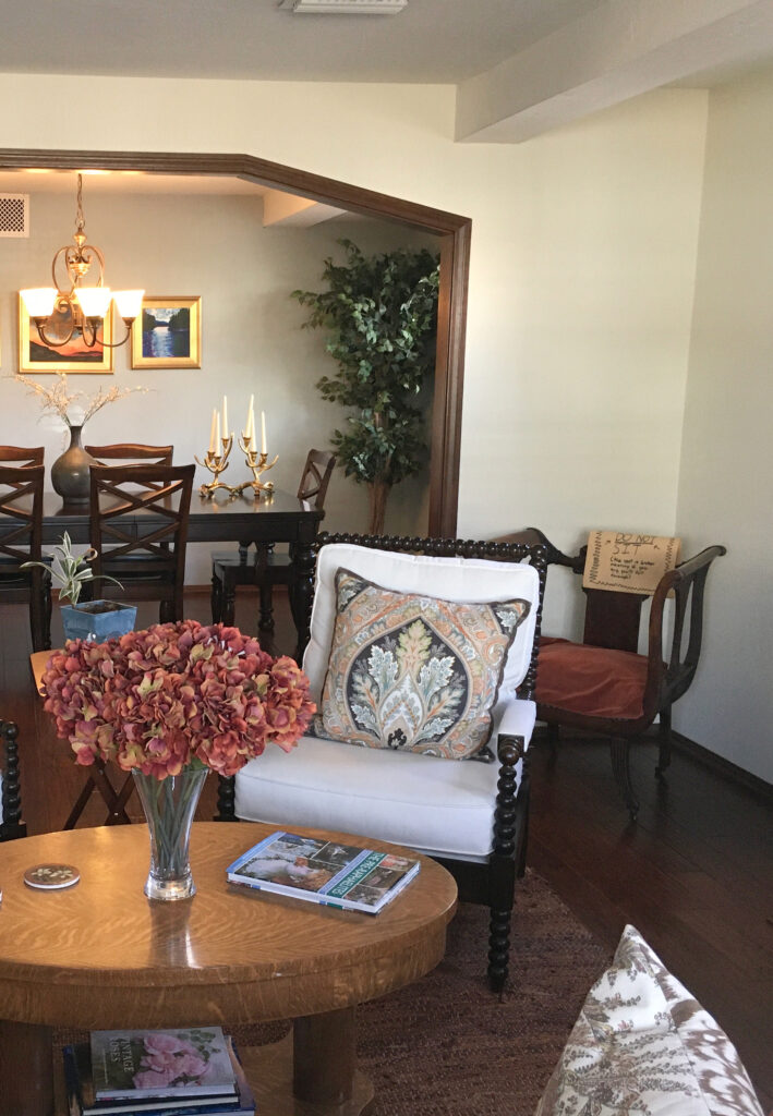

This wood was trendy in ’70s and ’80s homes on trims, doors, AND cabinets. Some people refer to it as ‘walnut,’ which it can look like. Some walnuts look brown, whereas others pick up a touch of red or even a bit of yellow.
Ideas to Update Your 1980s Kitchen
DARK, ESPRESSO COLORED WOOD
This finish was popular on cabinets, particularly in the late 90s and early 2000s, and it is known for its DRASTIC depth. More often than not, this wood color has a violet undertone, although some species flash a touch of red and, more rarely, yellow.
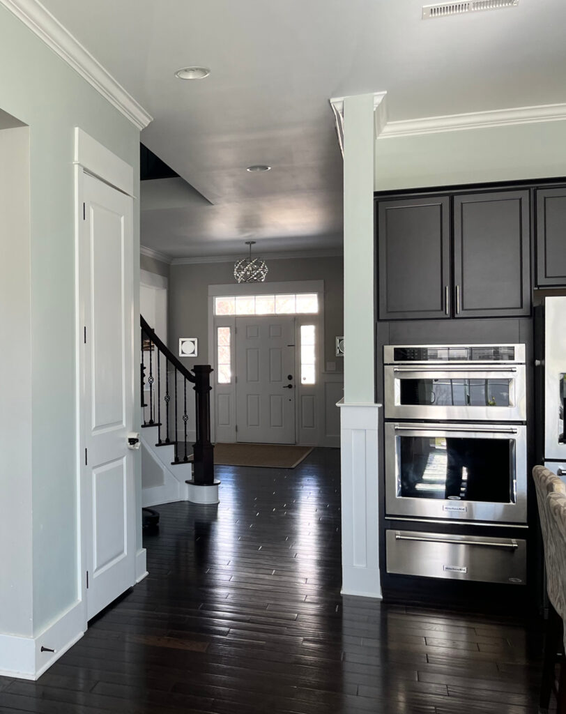

In the above kitchen, the dark wood floors and cabinets have a violet undertone, and I might see a tiny wink of red in that floor, too…
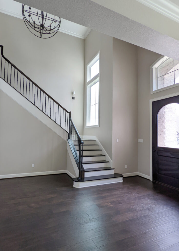

Just LOOK at the purple undertone in this wood floor!
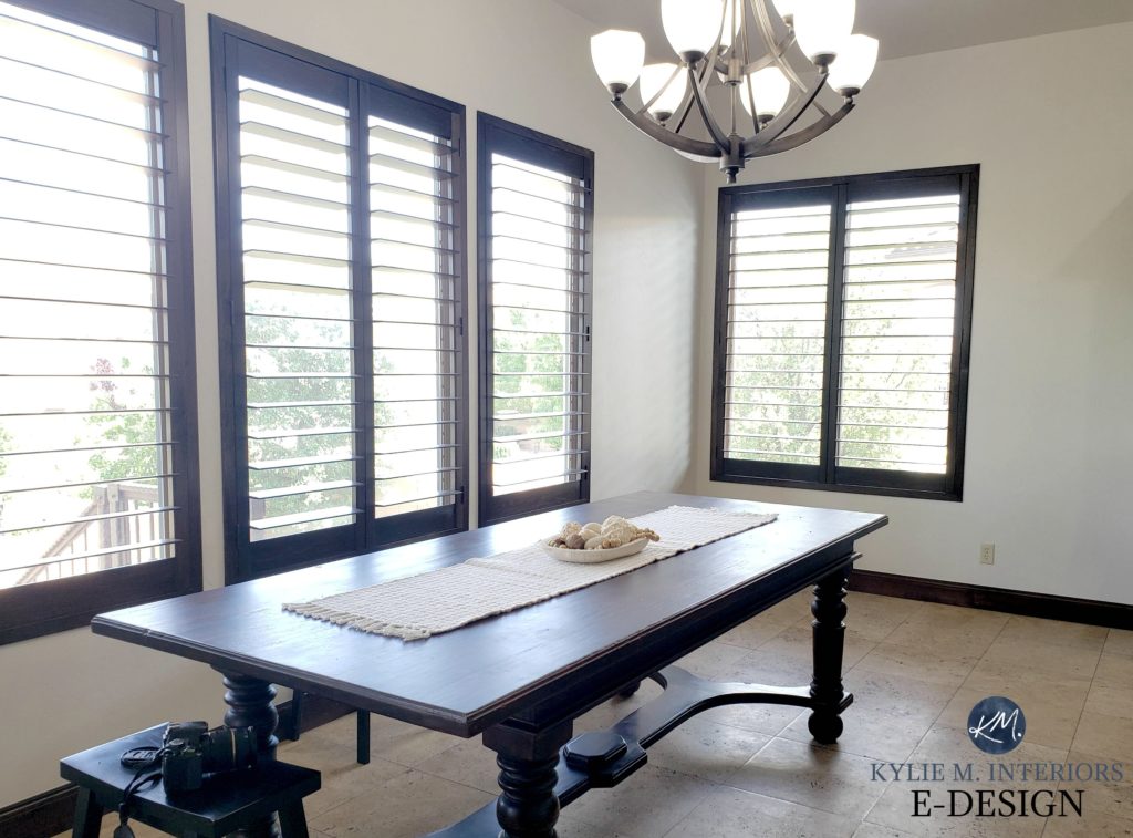
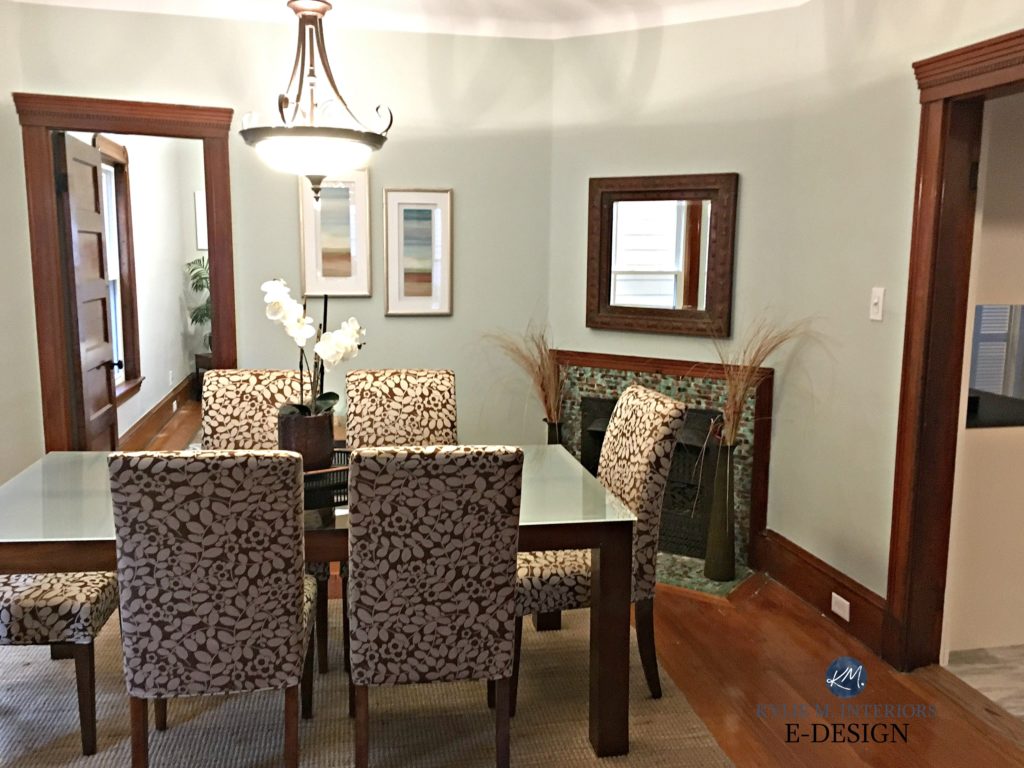
Compare the wood floor in the above image to the window trim in the dining area below. Does the wood in the top image seem more purple and the bottom a bit more rich brown (orange-red)?
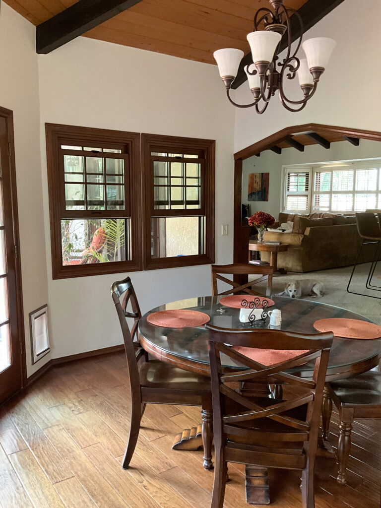

Again, figuring out which undertones your wood DOESN’T have can help you see which ones it DOES!
Lastly…
IF YOUR ROOM HAS DARK WOOD & LOW LIGHT
If your room lacks natural light and your interior lighting doesn’t compensate, be careful with many of these colors.
- Whites and off-whites reflect more light (having higher LRVs), but many of the colors listed below look best in rooms with adequate lighting.
- Non-whites and off-whites that are neutrals tend to look moodier and/or muddier when partnered with wood trims. This is a gorgeous look, but if you want more LIFE in your room, consider ‘colors’ or look at lighter, brighter shades.
While this wood isn’t terribly dark, here’s Sherwin Williams Accessible Beige (one of the colors we’ll look at shortly) with wood trim…
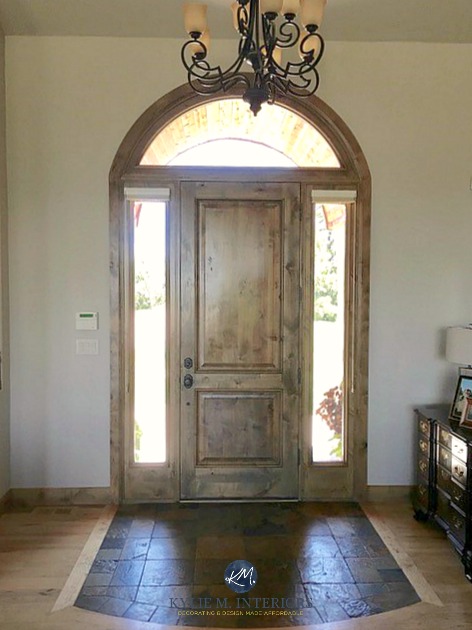

And here’s Accessible Beige with white trim…
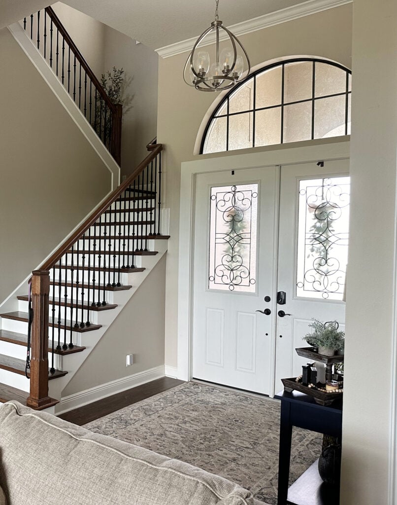

LOVE the dark wood floor, treads, and railing!
Both are pretty, but notice the shift in energy and the play between the white trim and walls vs. the wood trim and walls.
The thing is, if you have white trim, these colors have something to contrast with, and the play of colors can be a bit more interesting in that way. When you have dark wood (trims, in particular), your paint color doesn’t have that degree of contrast, and you risk your room looking heavy and drab.
Notice how some colors below come to life with dark wood floors and cabinets but WHITE trim rather than wood.
Again, to add energy to your space, consider ‘colors’ or explore some off-whites or whites to add more life to your space (or consider these non-painted related tips).
Now, without further ado…let’s hit some hues.
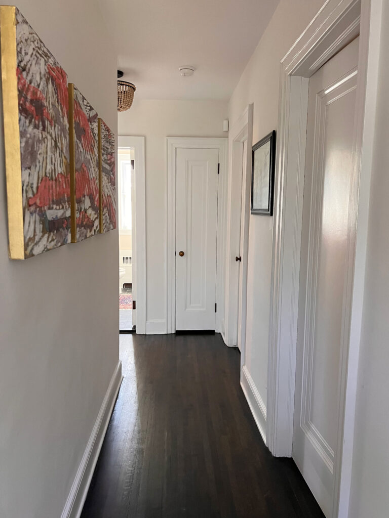

These colors won’t suit EVERY dark wood finish, but they’re the PERFECT place to start your color journey!


1. SHERWIN WILLIAMS BALANCED BEIGE 7037
Balanced Beige is one of my favorite light-medium shades if you want a slightly cozier but still modern-looking beige for your room. It’s popular because it leans slightly into gray rather than having a typical beige-golden look.
Balanced Beige doesn’t have an overt undertone, which means a minimal commitment to green, yellow, orange, or pink (common with this type of neutral). Of the undertones, a vague green comes up the odd time, but it’s situational. More people find it looking a touch taupe.
Colors like Balanced Beige offer a calm, organic approach. While they do best with decent light, they can be gorgeous if you’re okay with a slightly moodier, muddier vibe.

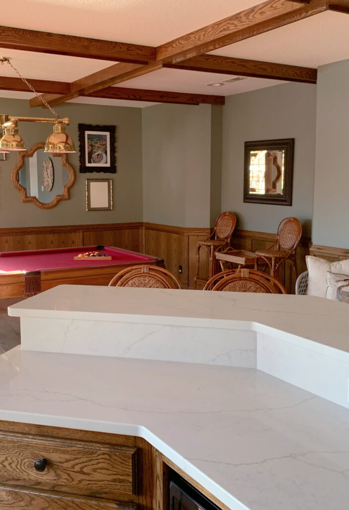
As shown below, the Pavilion Beige is similar to the Balanced Beige but has a touch less gray…
Notice how red the ceiling beams and trim are – they LOVE the wee wink of pink undertone tucked in Pavillion Beige! Don’t let the ‘p’ word scare you; it’s a beige with an orange undertone. I’m just being my usual particular self and pointing out the subtle bits here and there.
FULL COLOR REVIEW of Sherwin Williams Balanced Beige
SIMILAR SHADES OF BEIGE TO EXPLORE…
Because one color doesn’t fit ALL homes, it’s good to make some comparisons.
- Sherwin Williams Accessible Beige has similar intentions but a lighter approach (it’s amazeballs, and we’re looking at it shortly).
- Sherwin Williams Loggia is QUITE similar, with just a tiny shift in undertones—watch that it doesn’t look murky green against some woods.
- Benjamin Moore Stone Hearth is beige-gray with a gray backdrop to calm it down.
- Sherwin Williams Tony Taupe is a fun guy and has a bit more depth to play with.
2. BENJAMIN MOORE REVERE PEWTER HC-172
When it comes to popular neutral paint colors, Revere Pewter is hard to beat. So it’s no surprise that it also looks great with white trim and wood trim!
However, being a warm, muddy shade of gray, Revere Pewter appreciates a room with at least moderate light. You might not notice its green undertone and depth as much as you would against white trim, but it can still be pretty and organic with a wide range of wood stains. Read its full color review (link below) before biting the bullet—as with any color.


OTHER WARM GRAYS TO EXPLORE
- Sherwin Williams Colonnade Gray is a touch grayer with a bit less green undertone.
- Benjamin Moore Rodeo is like a lighter version of Revere Pewter with similar intentions.
- Sherwin Williams Agreeable Gray is a more noticeable shift but can be hit-and-miss.
- Sherwin Williams Amazing Gray is kind of like a darker, slightly greener take on Revere Pewter.
Paint Color Review of Benjamin Moore Revere Pewter
3. BENJAMIN MOORE GRAYSTONE 1475
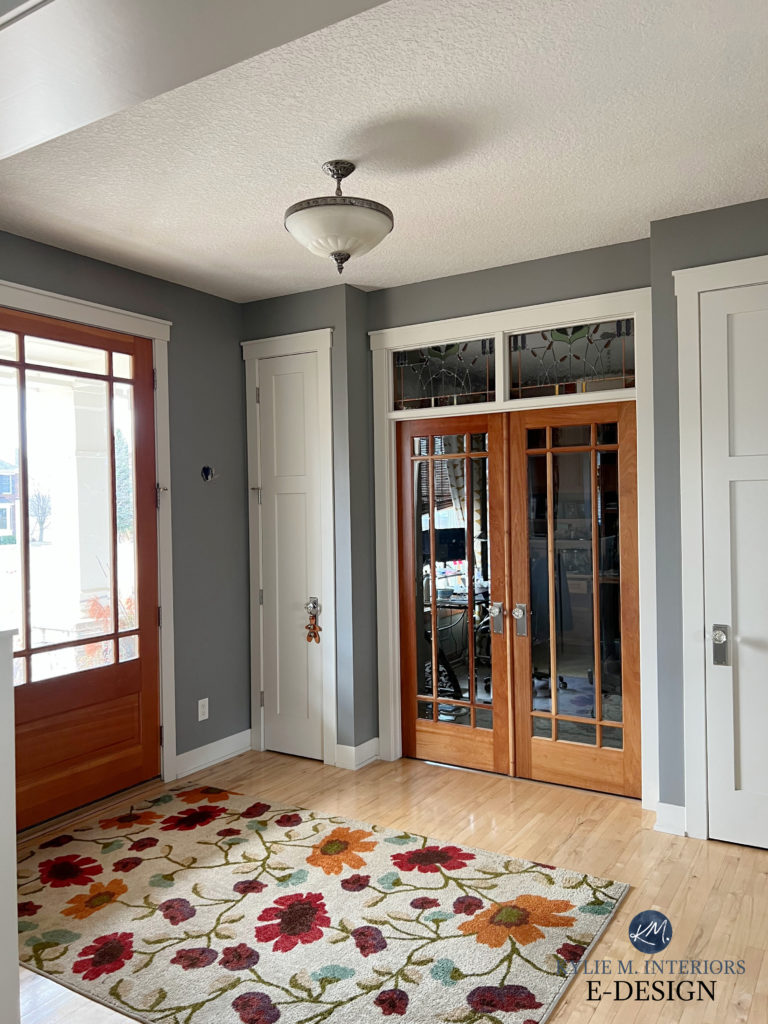
For those who want a darker shade, it’s easy to see how stunning Graystone looks with the warmth of the wood doors (orange-red)…
Graystone’s slightly warm gray/greige approach balances the warmth of the wood without making the room look cold and uninviting. Its green undertone contrasts with/complements the wood doors. However, it’s the warm white trim that really sets it off.
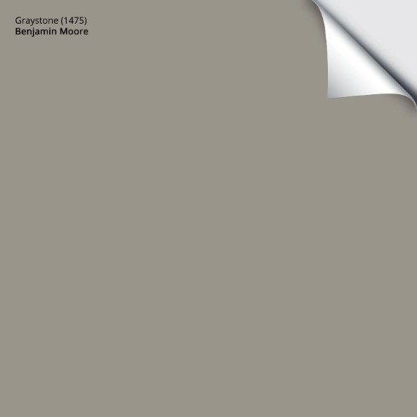
Here’s your Peel & Stick sample of Graystone…
COLORS THAT ARE SIMILAR TO GRAYSTONE FOR COMPARISON
4. SHERWIN WILLIAMS WHITE DUCK 7010
White Duck is an off-white cream heavily sedated by a beige-gray base, which calms down the yellow. Technically, this color belongs in my other dark wood blog post, but I wanted to mix things up to show you alternative options!
The 5 Best Off-White Paint Colors: Undertones and More
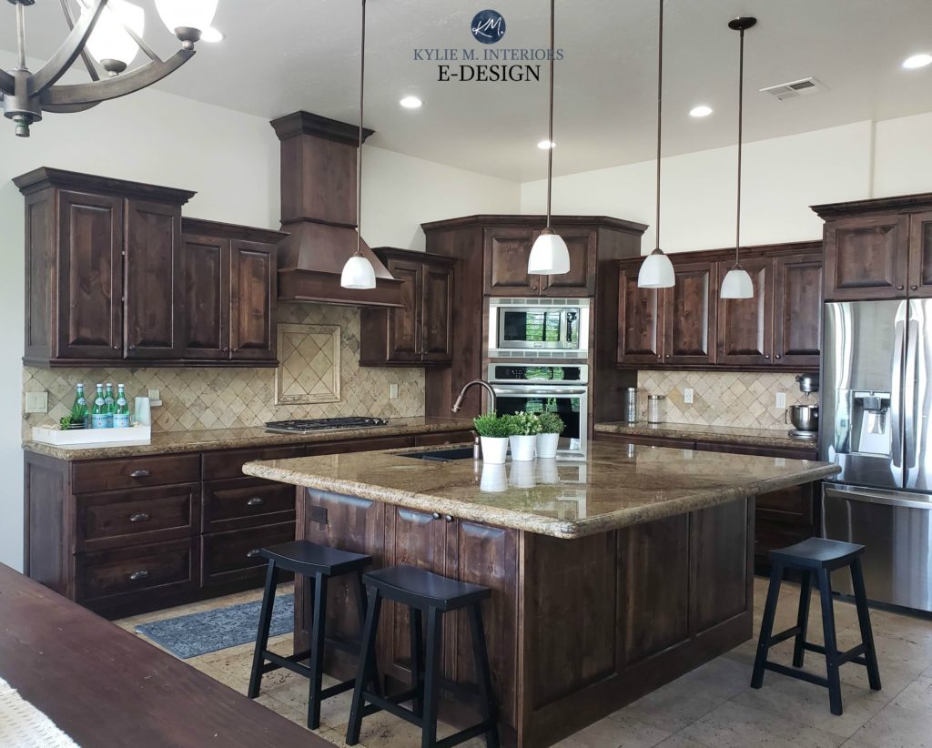
As you can see in the above kitchen, while the travertine tile backsplash would love a bit more of a beige tone, White Duck offers a muted, subtle warmth that helps to balance the weight of the dark wood cabinets. By the way, these cabinets have a violet undertone—look carefully. Can you see the purple? If not, three slaps with a wet noodle. Just joking; not everyone’s a color weird like me.
If White Duck were creamier, it could be iffy with the above purple-toned cabinets, as cream = yellow. As is, it’s a happy medium between the cabinets’ undertone and the more beige preferences of the backsplash, countertop, and tile floor.


With no white to compare it to, White Duck can look DARN LIGHT with natural light!
When using light and bright paint colors like creams and off-whites with dark wood finishes, make sure your home décor can visually support a high-contrast look. Without getting into too much detail, you need other high-contrast items in your room that mimic the contrasting combo of your trim and walls.
COMPARING A FEW OTHER SHADES TO WHITE DUCK
- Sherwin Williams Shoji White is White Duck’s kissin’ cousin
- Sherwin Williams Aesthetic White shifts out of yellow-cream and introduces a bit of beige (mad love)
- Benjamin Moore Ballet White is a bit darker and warmer
- Sherwin Williams White Heron takes a slight departure with a brighter approach
Paint Color Review of Sherwin Williams White Duck
Remember to choose the best color for a north-facing or south-facing room!
5. BENJAMIN MOORE COLLINGWOOD OC-28
Collingwood is one of my favorite warm gray paint colors with its soft, subtle violet undertone. This particular undertone can be a beautiful complement to many dark wood finishes, especially those with red or violet hues, but it can also complement some orange and yellow undertones.
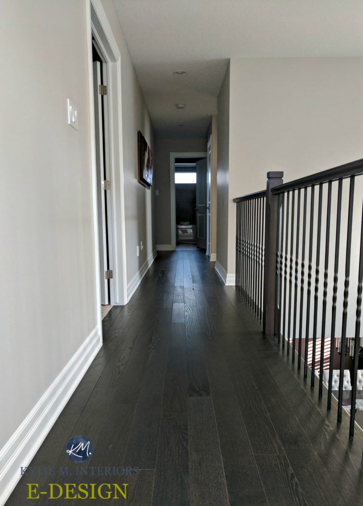

The Best Paint Colors for a Dark Hallway
And while there’s no shortage of popular grays to choose from, when it comes to dark wood trims, cabinets, and flooring, I usually prefer light grays that lean into a violet undertone, more so than blue (learn all about gray undertones HERE).
Unfortunately, I don’t remember what color the walls are in this next beautiful home. Also, the Kelvins of the bulbs will skew how it looks, but I would guess that this is the general vibe of a warm gray like Benjamin Moore Classic Gray. This off-white warm gray is lighter and a bit warmer than Collingwood but can also harbor violet (violet-pink) undertones.
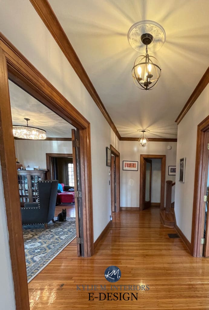

OTHER WARM GRAYS WITH VIOLET UNDERTONES
FULL Paint Color Review of Benjamin Moore Collingwood
If you’re looking for the BEST WHITE PAINT COLORS to go with your dark wood, I have a blog post dedicated to this topic. I’ve included a link at the end of this post for you (I’ve got one for OFF-WHITES, too).


6. BENJAMIN MOORE EDGECOMB GRAY
Oooooo, I love me some Edgecomb Gray with wood! Edgecomb Gray is a fabulous paint color, bridging the warm and cool worlds. Its very non-committal undertones make it happy with a wide range of wood colors, species, and finishes.
Look at how STUNNING Edgecomb Gray looks with this living room’s dark wood (oak) floor…
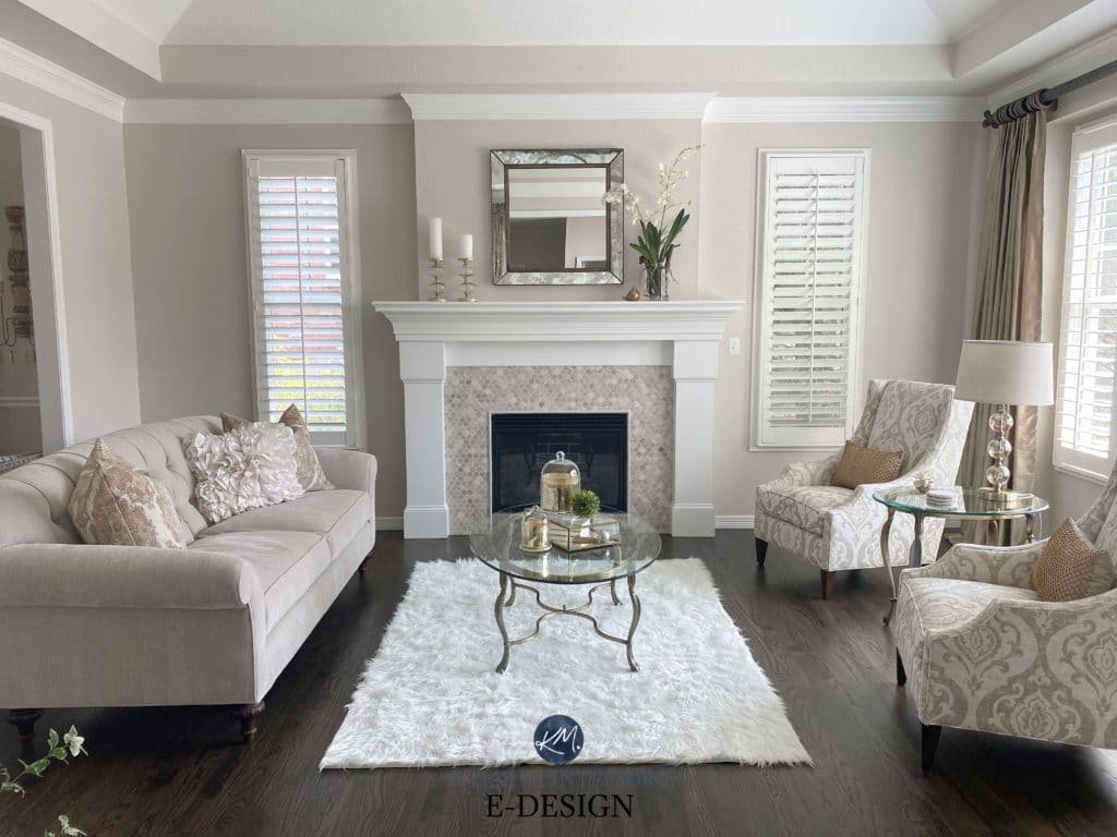

OTHER FLEXIBLE COLORS TO CONSIDER
I would love to tell you that Sherwin Williams has a similar or at least comparable shade, but Edgecomb Gray really is a creature unto itself. However, this doesn’t mean there aren’t colors with similar intentions and versatility.
- Sherwin Williams Modern Gray is a lovely take on a warm gray taupe. It’s different from Edgecomb Gray but still somewhat flexible. It’s as close as Sherwin William’s has.
- Benjamin Moore Winds Breath is a lighter shade of Edgecomb Gray (but NOT literally; there are shifts).
- Sherwin Williams Egret White is a personal fave, right up there with Edgecomb Gray, for its versatility and pretty softness.
- Sherwin Williams Mortar (a newer shade) is sure to be a fave with great flexibility – it’s a good shade lighter than Edgecomb Gray.
- Sherwin Williams Whirlwind, another newer shade in the Emerald Designer Edition, is worth exploring. It’s a bit more gray-taupe than Edgecomb Gray and has great potential.


Paint Color Review of Benjamin Moore Edgecomb Gray
Dark trim tends to make light colors look LIGHTER than white trim – get some white paper alongside your samples to see their depth.
7. SHERWIN WILLIAMS SEA SALT 6204
If you want to explore the slightly COLORFUL range, a great place to start is with blues, greens, and violets heavily mixed with gray, such as Sherwin Williams Sea Salt.
Sea Salt is an awesome green-gray, but it’s a bit of a ninja, so be sure to check it out closely HERE.
Just be careful. As pretty as colors like Sea Salt can be, they’re quite high contrast with dark wood and can make a room look a bit dated rather than UPdated. Personally, I’m more inclined toward Sea Salt with dark wood flooring but less inclined with dark wood trim or cabinets.


If I’m interested in a color like this and have dark wood trim, I might add more depth along the lines of Benjamin Moore Imperial Gray. Notice how it contrasts with the dark wood dresser in this living room…
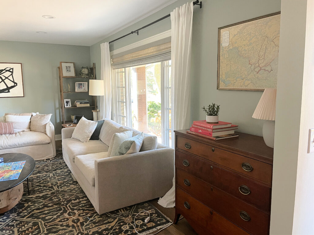

Sherwin Williams Austere Gray is another beautiful gray-blue-green for dark wood finishes…


COLORS THAT ARE SIMILAR TO SEA SALT
The 8 Best Blue-Green Blend Paint Colors
Paint Color Review of Sherwin Williams Sea Salt
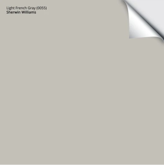
8. SHERWIN WILLIAMS LIGHT FRENCH GRAY 0055
While I can’t speak to the French side of things, as far as light grays go, Light French Gray is somewhat well-named! This light-medium shade of gray has a stormy look, so it’s not overly warm or cold. And while it caters to a vague purple undertone, it’s hard to find at the best of times.
Just LOOK at how Light French Gray complements the purple undertone in this dark wood flooring…


My FULL Paint Color Review of Sherwin Williams Light French Gray
Just make sure your room has a reasonable amount of natural light. Light French Gray has an LRV of 53, which means it’s a light-medium depth and can weigh a darker room down.
Here’s your Peel & Stick sample of Light French Gray…
COLORS THAT ARE SIMILAR TO LIGHT FRENCH GRAY
Should You Paint or Stain Your Wood Cabinets: A QUESTIONNAIRE
9. SHERWIN WILLIAMS AMAZING GRAY 7044
Are you looking for a more moody or organic vibe? Check out Amazing Gray. This amazing shade of greige is warmer than gray and has a minor green undertone, which prevents too much purple from sneaking through. Just be aware that some dark woods (with purple undertones) PREFER neutrals with purple undertones, so sample and compare!


Amazing Gray is great for an organic, natural look, not a fresh, clean one.
The Best Paint Colors for a Dark Room
SIMILAR SHADES TO SAMPLE & COMPARE
- Sherwin Williams Intellectual Gray is a bit darker and equally as beautiful. Just as when Kermit the Frog notices Miss Piggy – you might notice a bit more green pop up.
- Sherwin Williams Analytical Gray has a similar depth to Amazing Gray but grabs a bit more green, as does Jogging Path.
My FULL Paint Color Review of Sherwin Williams Amazing Gray
10. SHERWIN WILLIAMS ACCESSIBLE BEIGE 7036
If you’re looking for a more modern beige without being washed out, check out Accessible Beige. This beige is atypical, as where traditional beiges can lean quite golden warm, it has gray to calm it down and remove the edge (like the lighter version of Balanced Beige).


My FULL Paint Color Review of Sherwin Williams Accessible Beige
Lastly, here are a few more tips…
HOW DO YOU MAKE DATED DARK WOOD (TRIM or CABINETS) LOOK MODERN?
While painting your dark wood finish seems like the obvious update solution, many of these darker woods are way too stinkin’ gorgeous to cover up—they just need better friends. While this blog post is geared towards the best colors (shortly), there are a few other ways to update your dark wood.


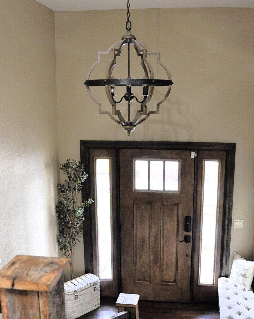
This 2000s Tuscan-style entryway could look more updated with a new wall color and some tweaked decor!
- Update surrounding hardware, whether it’s on cabinets, doors, or light fixtures. The right finish all depends on the style of your home. Older homes often suit a golden or antique brass (super trendy right now, if you choose the right style), whereas slightly more modern homes lean into polished nickel. Black can work on surrounding metal finishes, such as light fixtures, but disappear on dark wood cabinets and doors. Luckily, black is pretty universal, and if you do some black light fixtures, they’ll coordinate with your chosen cabinet/door hardware if you choose similar styling.
- Change your light fixtures. This isn’t just about the metal finish but also about the style. Edison bulbs are out of style, and dark wood finishes often benefit from light fixtures with white glass shades, as the white helps to reflect more light and brighten a dark space.
- Consider your decor and furnishings. Consider the small and big details, as they all add up to an overall impression!
- If you have dark wood cabinets, update your backsplash with a subway tile!
- Notice the photos in this blog post. Pay attention to what you think makes them beautiful, updated, and well-coordinated. Take these cues and apply them to your own home!
I hope I’ve helped to enhance your wood (a girl can dream!) and lower your stress level!
READ MORE
Update Dark Wood Cabinets with Modern Countertops & Backsplashes
The 4 Best Shades of White That Go With DARK WOOD
8 of The Best Off-Whites with Dark Wood
The 20 Best Paint Colors to Go With Oak and Wood
REAL Wood Kitchen Cabinets: Update Ideas
How to Mix and Match Wood Stains Like a Pro
The Best LIGHT Greige & Taupe Paint Colors
Update Oak or Wood Cabinets WITHOUT a Drop of Paint!
NEED HELP?
Check out my affordable Online Color Consulting Services!



Originally written in 2018, awesomely overhauled in 2024
